Monday, December 3, 2012

Too Much of a Good Thing!

It's that time of year again, time for all the Holiday Exhibits!!!

It's exciting, but a bit hectic trying to keep track of all the shows, when to drop things off, pick things up, and attend opening receptions.  So maybe by the time I finish writing this, I will be less confused.

The Holiday Small Works Exhibit, at Emporium Framing and Gallery, 261 Main Street, South Berwick, Maine.  Through February 2, 2013.

Hours: Monday through Saturday, 10-6.

I have 4 small tapestries in this exhibit, including Small Kilim With Bird (above right), and Moon Snail, Moon Shadow (below left)


 Holiday Art Sale, at the Warwick Museum of Art, 3259 Post Road
Warwick, RI. Through December 22nd.

Hours: Sun, Wed, Fri, Sat - 12.30-5.40,  Tues, Thurs - 12.30-8.30

I have some small tapestries in this show, like Flora Fragment 5, (below right), and also some tiny crocheted and felted baskets.

This photo of the Rainbow Baskets shows them nested inside each other.  You can see that the center of each basket is a bright color that kind of glows.

I had a lot of fun making these.


Winter's Eve, the 2nd Annual Juried Art Exhibit sponsored by the Friends of East Greenwich Library,  at the East Greenwich Free Library, 82 Peirce St, East Greenwich, RI.

The opening reception is Thursday, December 6, 5.30-7 pm, with music at 7.  Through January 4, 2013. Hours: Mon-Thurs 10-8, Fri-Sat 10-4.

The tapestry that was selected for this show is The Other Side of Me (right), a favorite of mine.

I hope I haven't forgotten something.

I know, this is only 3 shows, but it's all very exciting, and there are more shows coming up in 2013!

What I really need now is time to weave some more tapestries!

Thursday, November 8, 2012

American Tapestry Biennial 9

It's a great honor to be part of this exhibit, the 9th American Tapestry Biennial (ATB), which opened at the Dairy Barn Arts Center, in Athens, Ohio, on October 19. This gallery, in a restored dairy barn, and listed on the Historic Register, hosts the world renowned Quilt National and Bead International exhibits. ATB9 includes 41 tapestries by artists from 11 countries.

The ATB exhibits are sponsored by the American Tapestry Alliance (ATA). On the ATA website you can find out more about ATB9, peruse the Artist Pages, enjoy past and present online exhibitions, and even buy a full color printed catalog of this show and previous ones. 

Sadly, I was unable to attend the reception, as I had to be here for the Open Studio the next morning! Too bad I couldn't just beam myself there and back! The show will be at the Dairy Barn until December 16th, so if you're in the area, do visit.

I do plan to attend the opening reception at the second venue, which is at the Fort Wayne Museum of Art, in Fort Wayne, Indiana, on Friday, January 18th, 2013. The show will be up until February 23rd.

This is my tapestry, On the Edge of Chaos.  It's part of the ongoing Chaos series, and you can read more about it in a previous blog post.

I have promised myself I will never ever weave cursive text again, but I'm not sure if I'm reliable as I've broken these kinds of promises a few times....

I am also participating in the Holiday Small Works Exhibit at the Emporium Gallery in South Berwick, Maine, from now through February 3, 2013.

(click on the images to see larger versions)

Tuesday, October 23, 2012

West Bay Open Studios Tour

Saturday and Sunday from 11-5, I was in my studio, with a constant flow of visitors.

It was really fun to show people my looms and explain how tapestries are made. My visitors were a really interesting bunch and I had some wonderful conversations.

I spent 2 weeks cleaning the studio, framing and hanging tapestries, putting price tags up, putting away other stuff.

I had about 50 tapestries on display! The smallest is about 2 x 1" and the largest is 34 x 72." Even the piano was put into service with tapestries on top and on the music stand. I love my 2 new mini-easels on the left, I got them at Michaels for $8.99 each.


People were very interested in the Tapestry Diaries, and the current one was a really good tapestry for demonstrating, since it's pretty simple.  This is the month of October.


I created a powerpoint slideshow with images of the 3 new tapestries that are away in exhibits.

Now I have a nice clean studio to work in, now that's inspiring!

It's an honor to be part of this group of artists. Check out our website, it's really impressive. 


Tuesday, October 16, 2012

Open Studio Coming Up

Lots of tidying up and organizing this week, to prepare for this weekend's West Bay Open Studios Tour.  It's a free tour, including 22 artists who will all be opening their studios to the public this Saturday and Sunday, October 20-21, 11-5 both days.

I had such a great time last year, and I'm looking forward to doing it again.  The only sad thing is that we don't get to visit each others studios, because we are each hosting in our own studio. There are so many wonderful artists on the tour.

Check them out on the website, and if you're in the area, print yourself a map and come on out!

There are so many shows to enter this time of year, thus my two newest tapestries will not be in the studio this weekend.

Chaos in Darkness and Light (above left) is at the North Kingstown Free Library as part of the West Bay Open Studios preview exhibit. You can see it there for the month of October.


Tree Study (above), which traveled to Long Beach, California for the Pacific Portals exhibit in July, is back in RI, and can be seen in the RI Open exhibit at the Warwick Museum of Art until November 17.

I have 3 new tapestries on looms in my studio, plus the 2012 Tapestry Diary, so there will be plenty to see this weekend.

Hope to see you there!

Saturday, September 1, 2012

End of Summer Tapestry Diary

Saying farewell to summer this Labor Day Weekend, which coincides with the first day of September. That means a new month and a new color for the 2012 Tapestry Diary. I'm excited because it's my favorite color, BLUE!!!

July was red, and, as in May, I was still dividing my parallelograms into smaller triangles, and blending the red with grays and blacks and whites, although not so much white. Of course I had to weave a little flag on July 4th. It was always a special day for me, growing up overseas, a day when we celebrated all things American: hot dogs, baseball, and our old, faded flag.

I knew that August would be yellow, but little did I know the challenges of yellow.....a very tricky color. Blending yarn is different from blending paint, but you can't just take yellow yarn and blend it with gray and have a nice gray with yellow speckles (the way you can do with red). No, the yellow might decide to sneak off and hide, turning the gray into a strange shade of greenish something....

I also discovered that the pure yellows shouted too loudly next to the dark reds that were blended with gray and black, so I had to wait a bit, and introduce them later when they were surrounded by some quieter yellow blends.


In my yellow August, I decided to divide my parallelograms into curvy shapes instead of triangles, and they definitely move a lot more than the triangles. I don't know if I was thinking of the beach, and waves; maybe so, or maybe it's just an expression of all the nature I've been exploring on Cape Cod this August.


Here's a sunset photo, which inspired me to create a whole new blog, Wonders of Nature, just for my nature photos. I've been unable to resist all the sunsets and low tides and and and.......

Don't forget you can click on any image to see a larger version.  See the May Diary post for links to previous tapestry diary posts.

Sunday, August 5, 2012

The Long Lost Chronicles of Angers

Finally, a year later, I am writing about my trip to Angers. I was intimidated by the vastness of the subject, so I procrastinated…now I can check it off my To Do list and put away some of the books that are cluttering up my coffee table!ApocBooks

When my husband told me he had a meeting in Paris, in late August 2011, of course I was delighted to tag along. I wanted to see the Lady and the Unicorn tapestries at the Cluny Museum (which I wrote about here), and I had been meaning to visit Angers for a long time.

Angers is a charming city, in the Loire Valley, and the chateau is home to the famous Apocalypse Tapestry, the largest medieval tapestry, and one of the Seven Wonders of the Tapestry World. (I just made that up, but maybe someone should come up with a list!)

I was proud of myself for successfully taking the 2 metros to Gare Montparnasse in time for my TGV train to Angers. I find it stressful finding my way in a strange city, so I was relieved when my French tapestry friend, Marie-thumette Brichard, offered to meet me at the station in Angers.

ChateauAngersWithBrichardsShe and her husband, Jean-Michel, met me at the station, drove me all around Angers, bought me a museum pass and a delicious lunch. At the end of the day, they waited at the station to make sure I got on the correct train. It was so nice to be taken care of, and not have to worry about getting lost or missing my train! Thanks!

Our first stop was the Musée Jean Lurçat et de la Tapisserie Contemporaine. This museum is in a spectacular 12th Century Gothic hospital, complete with cloisters, storerooms and cellars. I assume that most tapestry folk know about Jean Lurçat who is credited with the 20th century revival of tapestry. The story goes that tapestry fell into a decline in the late Renaissance, when tapestry weavers were forced to weave exact replicas of painted designs provided by famous artists like Raphael. Lurçat believed that the art of tapestry could be revived by learning from medieval tapestries like the Apocalypse.

LurcatChanteDuMonde Lurçat was a thorn in my side for many years, as people quoted his strict rules, saying that tapestry weavers should never “copy” painting. Some people were upset with me for weaving tapestries that translate my paintings. Like any artist, I reserve the right to create my art based on what inspires me, not on a set of 50 year old rules. I almost forgave Lurçat after I saw Le Chant du Monde (the Song of the World), a series of 10 tapestries inspired by the Apocalypse tapestry, and woven in Aubusson from 1957-1967.

Each of these tapestries is about 4.4 meters high. The width varies from 2.26 to 13.6 meters. They all have a black background, with images in bright colors. The titles are The Great Threat, The Man of Hiroshima, The Mass Grave, The End of Everything, Man in Glory at Peace, Water and Fire, Champagne, The Conquest of Space, Poetry, and Ornamentos Sagrados.

(Left: postcards of Le Chant Du Monde)

The first 4 tapestries are dark and disturbing, dealing with the effects of nuclear war. The next 5 tapestries represent rebirth, humanity in harmony with nature, and human accomplishments. The last tapestry is somewhat of a mystery, as Lurçat died just before it was finished, and never got to write up notes about it.

(Below right: Water and Fire, detail)

LurcatWaterandAir In The Conquest of Space, it’s interesting to see that Lurçat had the weavers use color blending in some of the wefts, a technique he had initially rejected as being too similar to painting.

At first I did not like these tapestries, something about the style repels me…the images are broken into small shapes that are very sharp, pointed and dangerous looking; but the more I looked at them, the more fascinating they became.  It’s a monumental project, and was financed completely by the artist. Standing in that enormous gallery with the tapestries all around me was awe-inspiring.

In another gallery at the same museum was an exhibit called “Asie – Europe: Arte Textile Contemporain,” featuring 30 works by 21 artists from Japan, South Korea, Germany, France, Luxembourg, Belgium, Hungary and Italy. I particularly enjoyed works by Marie-Noelle Fontan, Koko Shimomura, and Ishi Kakuko. Photos were not allowed, sorry…..

ChateauAngers After lunch in an outdoor café, we visited the Chateau d’Angers, a beautiful 9th century castle overlooking the Maine river. It has a long and interesting history, but I was there mostly for the tapestry.

(below: less than half of the tapestry)

ApocalypseTapestryRoom1 The Apocalypse Tapestry was commissioned by the Duke of Anjou, and woven in Paris between 1377 and 1380. The book that I bought in the giftshop, (The Apocalypse Tapestry of Angers, by Liliane Delwasse) says it was woven in the workshop of Robert Poisson. The Book of Tapestry, by Pierre Verlet, gives the credit to Nicolas Bataille, but Delwasse says he was involved as a producer (I think it was similar to being a producer for a Hollywood movie!).

(below: The Beast of the Sea)

Beasts The narrative is based on the Apocalypse from the Book of Revelation by Saint John the Divine; it was a popular story at the time, a classic struggle between good and evil, and overflowing with angels, beasts and demons.  Below is my favorite scene,  “The Frogs,” in which we see Satan and the Beasts vomiting frogs. LesGrenouillesDuring the French Revolution, the Apocalypse Tapestry (like many others) was cut up and used for practical purposes, such as insulation, floor mats and the like. Luckily these fragments were retrieved and restored in 1848. The original tapestry was woven in 6 pieces, each 78 x 20 ft, and including 90 different scenes. The current tapestry includes only 71 of the scenes, and is in many smaller pieces, still a total of 104 meters.

ApocalypseTapestriesRoom2 They are very faded on the front, but the backs are still bright. The lighting in the custom designed gallery is dim, adequate for viewing but not for photography, so I apologize for the poor image quality.

AngersStuff Both the Chante Du Monde, and the Apocalypse Tapestry are enormous subjects, and I can only give you a little taste. If you follow some of the links you can find more information. The best source I have found is the book sold at the chateau. Good luck finding it….I recommend a  pilgrimage to Angers!!!

Here is a superb video of the Apocalypse Tapestry.

Monday, July 2, 2012

Thanks, it’s an honor!

To be accepted as an Elected Artist member of the Art League of Rhode Island.

The annual meeting was at the historic Aldrich House, in Providence, on June 21st. The five new members were invited to each bring a piece of their art to be put on a lovely wrought iron  easel. I brought Chaos (don’t I always?)Austin_Chaos_ATA

The new members were introduced during the meeting. It was exciting to meet the other artists, and it turned out not to be at all intimidating, as everyone was very friendly.

ALRI was founded in 2000 by a group of about 40 artists, and provides exhibitions for member artists in all media!

As a tapestry artist I appreciate this open-mindedness, as some arts groups are not so inclusive. Rhode Islanders are far more informed about the textile arts than people in other regions, and my theory is that this is the result of growing up with Slater Mill, the birthplace of the American Industrial Revolution. Every child in RI visits there at least once on a school field trip. In addition to this, the Rhode Island School of Design, with their excellent Textiles department is very prominent here.

The mission statement reads:

The Art League of Rhode Island (ALRI) was formed based on a shared vision to encourage and foster artistic recognition and growth among Rhode Island Artists. ALRI was incorporated with a goal to contribute, encourage and promote integrity and excellence in the arts in Rhode Island. The Art League of Rhode Island numbers among its founding members some of Rhode Island's most prominent artists working in a wide range of media from painting to furniture making.

WarpingLoomThe 2012 Annual Exhibition will be opening on August 31.

More information about that later.

In the meantime I need some new tapestries to exhibit!

Time to leave the computer and get back to my looms!

Thursday, May 31, 2012

Tapestry Diary: Fun with Geometry

May is blue, at least this year it is. Blue, with green and black and white. I am using this year’s diary to explore ways to add color to my black and white tapestries, although I forgot all about that this month! AustinMay2012

Just to mix things up a bit, I broke some of my parallelograms into 4 pieces. Then I had a revelation: you can break a parallelogram into 2 triangles! What fun. After one week of triangles, I was sad that I couldn’t see the parallelograms any more, so I thought I would try to keep the 2 triangles in each day similar in color, and then have a more noticeable difference between each day. The last week, because I was always weaving light, then dark, I ended up with a surprising chevron pattern. I love this kind of surprise.

I weave a parallelogram every day. That pattern started years ago as a variation on lazy lines, just using different colors. It avoids slits. Every month I change the color scheme, and also the direction. On the bottom line of the May photo you can see the last 2 days of April on the right side, then the number 5 for the first day of May on the left. There is always a triangle at the intersection.

Until I wove the last day of May, I had no idea what I would do in June, but now I have a plan. Check back in a month, and I’ll post a photo of the first 6 months.

For links to the 2010 Tapestry Diary click here.

Here are some links to the 2012 Tapestry Diary

January       February      March      April

Monday, May 7, 2012

What is Tapestry Anyway?

Up to now, I assumed that most of my readers were fellow tapestry weavers. Perhaps not, since I give out my cards to lots of random people. So in case you were wondering….

Tapestry is a weaving technique that creates an image or pattern by using discontinuous weft.

Discontinuous what?

The WARP is the yarn that is attached to the loom and kept under tension; in this case, it’s the white cotton that runs vertically. The WEFT is the yarn that weaves under and over the warp threads to create the fabric.frameweavingIn the photo above you can see that there are 3 different colors of weft, and each color weaves back and forth just in the area where it is needed to create the design; that is what “discontinuous weft” means.  (In most fabric weaving, one piece of weft travels continuously from selvedge to selvedge.)

RedscarfIn most tapestries, the weft is packed down tightly, covering the warp completely, so the design is made just by the weft.

That’s different from most clothing fabrics, where you can see both the warp and the weft. These are 2 different scarves that I wove a few years ago.

FabricI like to use different colors in the warp and the weft, to create beautiful color blends.

Pretty simple, right? Actually it takes a lot of practice to be able to weave even a simple tapestry like the one above.

What about tapestry designs that are a lot more complex?

UnicornInCaptivityWeb2The photo on the right is The Unicorn in Captivity, a recently woven recreation, at Stirling Castle in Scotland. 

The original was woven around 1500, and hangs in the Cloisters, in New York City. 

For more about the Hunt of the Unicorn tapestries, and the project at Stirling Castle, see my previous blogpost  here.

For more information about tapestry weaving check out the American Tapestry Alliance website.

Wednesday, May 2, 2012

April Tapestry Diary

April was supposed to be yellow, but I couldn’t resist adding some light green too.

I was away for a week in early April, taking care of my 6 month old grandson, Silas. So when I came home, it was obvious what I had to do to fill up those days! I love designing and weaving text.

AprilMonth
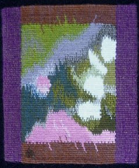
While I was away I visited the Textile Museum in Washington DC, and saw a wonderful tapestry by Archie Brennan (see the previous post), which inspired me to try different patterns in April. I am still thinking about ways to include small bits of color in my black and white tapestries, so this is good research.

I did tiny thin stripes, and one pick spots, and pick and pick spots for fatter dots, and color blends with dots, and dots created by alternating 3 colors of weft.

AprilDiaryThe dark shape on the top row, and the one just like it, one row down from the top, on the right, is dark gray wool mixed on the bobbin with a black and white cotton for the background.

Then there are small and bigger dots of light green, at irregular intervals, also mixed with the black and white cotton, and some dots that are pure green. I like the subtle, variegated effect. You can click on the photos to see them bigger.

What to do with May? I guess I’ll find out tomorrow…..I was too busy to weave it today, and now it’s almost midnight and I’m too tired.

AprilDiaryDetailDid I mention I have color-graphemic synesthesia? That means I associate certain colors with letters and numbers. It was much clearer to me when I was 5 or 6 years old, but there are still certain letters and numbers that are very clearly one color.

May could be green, because the letter M is green, but then I already did green for March; probably for the same reason. I was thinking about how I will weave the number 5 on the first day of May, then realized that May could be blue, because the number 5 is definitely blue (just like the letter S; must be something about that shape).

Anyway, blue and green will do nicely, and I can practice weaving the sea….I’ve been thinking about that lately.

Wednesday, April 25, 2012

Sourcing the Museum

at the Textile Museum, Washington DC
March 23 through August 19, 2012

“Museum  <Greek mouseion, temple of the muses…”

Jack Lenor Larsen invited 11 artists to each choose a piece (or pieces) from the museum’s collection, to use as their muse while creating a new, contemporary textile. The new pieces are displayed next to their muses, to (as the exhibit guide says) “reflect the connections between past and present.”

The artists are Olga de Amaral, James Bassler, Polly Barton, Archie Brennan, Lia Cook, Helena Hernmarck, Ayako Nikamoto, Jon Eric Riis, Warren Seelig, Kay Sekimachi, and Ethel Stein.

As a tapestry weaver, I was drawn to the exhibit because of the contemporary tapestry, but I knew I would also find other interesting pieces in the show. Unfortunately there was no catalog, and I was not allowed to photograph the exhibit. I’m sorry I have to write this without images, but you can look at a slideshow on the Textile Museum’s website here. (I had to use Google Chrome to see Archie’s slide full sized, it would not work on Firefox). You might want to open the slideshow in a separate window so you can refer to it as you read.

The first piece I saw was Archie Brennan’s tapestry “Sharing a Warp – a Meeting of Pure Chance – Asia/Mexico/the Himalayas - Seeking Unity 2011.” The title refers to the 3 pieces from the museum’s collection that he “chose” at random: pair of white embroidered festival pants from Mexico, a Kira from Bhutan , and a 19th century Shirvan rug from the Caucasus.

Archie calls this piece a “pseudo-collage,” because he created an illusion of 3 pieces one on top of the other, even weaving subtle shadows to indicate how they are layered. I was interested to see that Archie used the technique of doubling warps to change the sett. He used 10 ends per inch to weave the text at the bottom, which reads “…three works chosen at random from the collection of the Textile Museum Washington…” but then doubled the warps to create a coarser texture of 5 ends per inch for the Shirvan rug section. This coarser texture reproduces the pile of the original rug, and also allowed him to use pick and pick to make bold vertical stripes representing the fringe. He says that the fringe was a way to emphasize its “hanging nature.”

Above the rug are the two other references, the finely embroidered Mexican pants on the left, and the diamond patterned Kira on the right. I was particularly drawn to the Kira, where Archie used various woven patterns of dots, stripes, checks and diamonds inside each diamond shape, and the triangles forming the background; the woven patterns are intended to emphasize the cloth nature of the Kira, and they gave me a sense of deja vu, as if I had seen them as a sweater or a tie in a much earlier Archie Brennan tapestry.

The diamond shapes are not centered, so the width of the yellow outlines varies, creating an amusing distortion. Archie said he did that because he felt it was getting too symmetrical. He says he also pulled the warp slightly off vertical in another area, although I can’t see it from the photo. Another detail that caught my eye was the visible shiny red stitches holding together the vertical stripes.

Archie wove this tapestry without a cartoon, just using some sketches, notes and working drawings where needed. He said he loves the journey up the weaving, and the way the tapestry grows on the loom, and admitted that he had been influenced in this method of working by Susan Martin Maffei.

Lia Cook’s jacquard weaving “Coptic Manga” blew my mind. Her muses were 2 small Coptic tapestry fragments, and I recognized the faces in her piece immediately, even with the “altered scale.” The piece looks so different from a distance where the colors blend, and from close up, where you see the woven pattern structure and the separate colors; kind of like an impressionist painting. It made me think about my own black and white tapestries, and my quest to add color to them. The way she has added color to the black and white is reminiscent of hand tinted photographs, or, in this case, comic strips. Very inspiring. If you click on any of her images here you can see a close up of the weave structure.

Jon Eric Riis was inspired by a Chimu jacket from Peru (1250-1350), which might be the most stunning piece in the show, although Riis’s own tapestry jacket is definitely a show-stopper. The “Congressional Constraint Tapestry” is “a straightjacket in politically-charged red and blue, with donkeys, elephants, and hybrids of the two, fringed with boxing gloves.” Tapestry weavers will be impressed that the pairs of boxing gloves (at least 72 pairs, I lost count!) are all individually woven shaped tapestries. The docent said that he had woven them on plane trips. The jacket itself is woven very finely, with glittery metallic thread, silk, horsehair and coral and gold beads.

Helena Hernmarck chose a tiny 9th Century Egyptian rug fragment, and enlarged a detail.  With her expressive, loosely woven surface, focusing on color, and showing the pile and the dissolving warp, I had to walk into the next gallery to see it from enough of a distance. Then it became very 3 dimensional.

You can read the Washington Post’s review of the show here. If you live close enough, don’t miss this show!

Sunday, April 1, 2012

Tapestry Diary Marches On

…sorry for the bad pun! March2 Here is the month of March, minus the first 3 days. Oops, when I took the photos I forgot that March started at the tail end of a February week.

MarchText Every line of parallelograms begins on a Sunday. Luckily, April 1 is a Sunday so that will be nice and tidy.

For March, I went back to my original idea of experimenting with ways of introducing little bits of color into my black and white tapestries. I’ve been enjoying the green accents.

MarchDetail I wove “MARCH,” one letter per day, which allowed me to use a favorite tapestry technique: weft interlock. I rarely use this in my tapestries, but it is very useful, particularly when you have a long vertical as in these letters.

For the rest of the month, as for most days in this diary, I wove what I felt like weaving. In the last week, I felt like dividing each day diagonally, creating triangles. One of the 3 basic shapes, the other 2 being rectangles and circles.

For more about the tapestry diary check herehere, and here.

Monday, March 26, 2012

Fiber in the Present Tense:

Contemporary Art Textiles by the Massachusetts-Rhode Island chapter of the Surface Design Association FiberInThePresentTense March 3- April 22, 2012 at the Arsenal Center for the Arts, in Watertown, Massachusetts.

FiberinPTI joined SDA recently because I had heard that the fall 2011 issue of their journal featured some tapestry articles.

It’s true, and it’s an excellent journal.

MalikSaberah Malik, Boundaries Unbound, shibori dyed polyester on steel base. (above)

I was too late to enter this exhibit, but I drove there for the opening reception on Saturday. I got lost a few times, and seriously considered giving up and going home, but I finally found it, and I’m glad I did!

CrascoIt’s a really impressive show, although it’s spread out on 3 floors, mostly in hallways. I would rather have seen all the works in one gallery without the other distractions.CrascoDetail

The juror was Alice Zrebiec. She selected Swimming Against the Tide, (above and right) by Nancy Crasco, for the SDA Award of Excellence. This piece is gelatin print, embroidery and stitching on silk organza, 36” x 36.”

McCarthyDiptych

McCarthyDetailKaren McCarthy, Unexpected Turns (diptych)  (above, and detail at left)

I don’t know much about printing, so it was educational. I took a silk screening workshop about 40 years ago, but can’t remember much about it.

I was intrigued by the textile texture in this print, and the artist explained to me that she prints through lace.

The call for entries reads:

“Scope, materials and subject matter are open and submissions may include surface design, woven, 2D and 3D structures, quilts, stitching, or any other contemporary art textile technique.”

GrotrianChasmLakeI had always assumed that SDA was limited to surface design (printing, painting, embroidering and embellishing the surface of a textile), but the organization seems to be inclusive of all fiber arts.GrotrianDetail2 

Nevertheless, most of the works in the exhibit are surface design, with very little that is woven or otherwise constructed.

I took an instant liking to this landscape, Chasm Lake,  by Carol Ann Grotrian (above and right)HoustonUndertheMicroscope

I love the ambiguity in the combination of shibori and hand quilting, which you can see much better in the detail.

I was introduced to a young artist from RI, Hannah Houston, a recent art school graduate. It’s nice to know there are still some young folks studying fiber arts.

Her piece, Under the Microscope, (left and below) is really stunning.


HoustonEvery time someone walked past it, the lightweight silk fabric would billow out from the wall, which was beautiful, but made it a bit challenging to photograph!

It is digitally printed with foil embossing.

I didn’t notice the title (Under the Microscope) until I got home, but it makes perfect sense when you look closely. I’ve always thought that microscope images could make great textile designs, and now I know it!

NobleAnother favorite is this powerful piece by Elin Noble, Conversation (left).  The description reads:

“Itajime clamp-resist on hand-woven hemp cloth, hand pieced with horsehair.”

I had no idea what itajime was, so I looked on Elin’s website and found this description:

“Itajime shibori, or clamp-resist dyeing, is based on wooden boards held on either side of accordion folded cloth, then dyed.”NobleDetail

That sounds exciting! I wonder if there are surprises after the dyeing? I love the horse-hair stitching. 

Don’t forget, you can click on most of these photos and see a larger version.

Better yet, go see the exhibit!