Monday, March 26, 2012

Fiber in the Present Tense:

Contemporary Art Textiles by the Massachusetts-Rhode Island chapter of the Surface Design Association FiberInThePresentTense March 3- April 22, 2012 at the Arsenal Center for the Arts, in Watertown, Massachusetts.

FiberinPTI joined SDA recently because I had heard that the fall 2011 issue of their journal featured some tapestry articles.

It’s true, and it’s an excellent journal.

MalikSaberah Malik, Boundaries Unbound, shibori dyed polyester on steel base. (above)

I was too late to enter this exhibit, but I drove there for the opening reception on Saturday. I got lost a few times, and seriously considered giving up and going home, but I finally found it, and I’m glad I did!

CrascoIt’s a really impressive show, although it’s spread out on 3 floors, mostly in hallways. I would rather have seen all the works in one gallery without the other distractions.CrascoDetail

The juror was Alice Zrebiec. She selected Swimming Against the Tide, (above and right) by Nancy Crasco, for the SDA Award of Excellence. This piece is gelatin print, embroidery and stitching on silk organza, 36” x 36.”

McCarthyDiptych

McCarthyDetailKaren McCarthy, Unexpected Turns (diptych)  (above, and detail at left)

I don’t know much about printing, so it was educational. I took a silk screening workshop about 40 years ago, but can’t remember much about it.

I was intrigued by the textile texture in this print, and the artist explained to me that she prints through lace.

The call for entries reads:

“Scope, materials and subject matter are open and submissions may include surface design, woven, 2D and 3D structures, quilts, stitching, or any other contemporary art textile technique.”

GrotrianChasmLakeI had always assumed that SDA was limited to surface design (printing, painting, embroidering and embellishing the surface of a textile), but the organization seems to be inclusive of all fiber arts.GrotrianDetail2 

Nevertheless, most of the works in the exhibit are surface design, with very little that is woven or otherwise constructed.

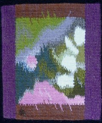
I took an instant liking to this landscape, Chasm Lake,  by Carol Ann Grotrian (above and right)HoustonUndertheMicroscope

I love the ambiguity in the combination of shibori and hand quilting, which you can see much better in the detail.

I was introduced to a young artist from RI, Hannah Houston, a recent art school graduate. It’s nice to know there are still some young folks studying fiber arts.

Her piece, Under the Microscope, (left and below) is really stunning.


HoustonEvery time someone walked past it, the lightweight silk fabric would billow out from the wall, which was beautiful, but made it a bit challenging to photograph!

It is digitally printed with foil embossing.

I didn’t notice the title (Under the Microscope) until I got home, but it makes perfect sense when you look closely. I’ve always thought that microscope images could make great textile designs, and now I know it!

NobleAnother favorite is this powerful piece by Elin Noble, Conversation (left).  The description reads:

“Itajime clamp-resist on hand-woven hemp cloth, hand pieced with horsehair.”

I had no idea what itajime was, so I looked on Elin’s website and found this description:

“Itajime shibori, or clamp-resist dyeing, is based on wooden boards held on either side of accordion folded cloth, then dyed.”NobleDetail

That sounds exciting! I wonder if there are surprises after the dyeing? I love the horse-hair stitching. 

Don’t forget, you can click on most of these photos and see a larger version.

Better yet, go see the exhibit!

Friday, March 9, 2012

Teachers and Lessons

For the latest issue of the American Tapestry Alliance’s quarterly journal, Tapestry Topics, the theme editor, Micala Sidore, asked:

What teacher (or teachers) have had particular consequence for your work as a tapestry weaver?

I didn’t have to think about it for long: Marcel Marois, because he was the first teacher who was supportive of my choice to weave tapestries that translate the marks of my paintings and drawings. That validation, which came at a crucial point, helped me to trust my instincts and continue in my own direction.

005 I also learned one very important practical lesson from Marcel: when weaving with 2 contrasting colors in my weft bundle, I learned to make a conscious decision about how the 2 colors interact. 

The dark wefts can always be on top of the light ones, or always underneath, or any combination of the two.

The weft can be twisted carefully, or it can be allowed to twist at random. At this point, with my black and white Chaos series, I am choosing to control almost every dot to get the exact effect I want.

Marcel also suggested that, in the tapestries secretmessage2 I was weaving from watercolor designs, adding a thin white thread (I used silk) would give the impression of the white paper showing through the translucent paint.

This is “Secret Message,” and you can see “Secret Message 2”  here.

Subscribe to Tapestry Topics here.