Sunday, October 16, 2022
Tapestry Touring International: The Natural World
This touring exhibition opened at The Guildhall, Much Wenlock, Shropshire, UK, in October, 2022, and was open for the month. The second venue will be in March, 2023, at Kirkleatham Museum.
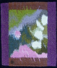
My tapestry is titled "Earth Bleeds."

Saturday, June 5, 2021
Pandemic Tapestries
Here I am, more than a year since the last entry. The pandemic seems to be receding in our state, and to a lesser extent in our country, and since we are fully vaccinated we can now visit with family members. We got to meet our new grand baby in April! Yay for us!
BUT: I just read that for the unvaccinated, there is as much risk now, as there was during the January surge, and in many other countries the situation is dire, with health care systems overwhelmed. This is not over.
 |
| Chaos: Pandemic |
This small tapestry was the first one I wove during the pandemic.
It is small, only 5 x 4 inches and was the first tapestry woven on my new Mirrix Saffron loom.
 |
| Chaos: Pandemic Nights |
This is the second pandemic tapestry, also woven on the same small loom.
Both of these are part of the long series of Chaos tapestries. I keep thinking that series is finished, but then there always seems to be a little more chaos to deal with.
I also finished the large Chaos tapestry that had been languishing on my loom for a few years, finally! It's still waiting to be hemmed and photographed, but here is a detail.
 |
| Sun Sets on Chaos |
Sunday, April 5, 2020
Social Distancing and the Tapestry Weaver
 |
| 2020 Tapestry Diary, Jan - March |
Well, I have been weaving my tapestry diary every day. This is it so far, all parallelograms this year, and so far the colors are wintry. That will change soon. For more about my tapestry diaries see here, with links to older posts.
 |
| Wintersweet, detail |
 |
| More Chaos in Progress |
As for the Corvid19 Pandemic, when my governor requested that everyone over 65 should just stay home, 3 1/2 weeks ago, it was kind of a relief since going out had been getting nerve wracking. A few days later the library where I work was closed (as they all are now), the Y where I swim closed, and everything was cancelled. I am lucky to live in an area where I can go for walks without passing more than a handful of people. I am discovering how nice it is not to be driving hither and yon doing errands daily. We are living through a moment in history that will be written about and remembered, and I can only hope that we are doing everything we can to help each other. Stay home, and stay well.
Sunday, August 4, 2019
What's happening?
I think it's time for an update on where my tapestries are traveling to, which will be useful for me when I start wondering where they might be....

This small tapestry, "Phantom Trees," is at the Wickford Art Association's Members Exhibit until August 11, 2019. Check it out soon!
"Into the Mist" is in Small Tapestry International 6: Beyond the Edge. The first venue at Northwestern State University, Natchitoches, LA, it ended last week (sorry if you live nearby and missed it....) The second venue is Augustana Teaching Museum of Art, Augustana College, Rock Island, IL and the opening reception is September 6, 2019. For more info and to purchase the print catalog go here.

Three of my small Chaos tapestries are traveling to Maine for this exhibit:
tapestry: the new wave
August 6-31, Down East Gallery, Edgecomb, ME
(Click on the postcard to enlarge it)

COMING SOON:
IMPACT: climate change
a collaborative exhibition by TWW (Tapestry Weavers West) and TWiNE (Tapestry Weavers in New England).
First venue: Belmont Gallery of Art, Belmont, MA - Sept 8 - Oct 13, 2109 (reception Sept 15, 1-3)
Second venue: Mills Building, San Francisco, CA, Dec 16, 2019 - March 13, 2020 (reception Jan 30, 2020, 5.30-7.30)


Friday, February 15, 2019
Elements: Earth, Air, Fire, Water
 |
| LaDonna Mayer, Earth: Silk Tree |
 |
| Janet Austin, Earth: Another Forest Through the Trees |
 |
| Letitia Roller: Water: The Hea(r)t of it All - Glacier Melt |
AUSTRALIA: Sally Blake-Edwards, Dan Edwards, Brenda Goggs, Dimity Kidston, Valerie Kirk, Lisa Molvig, Whitely Rosenberg, Shunyam Smith, Anton Veenstra, Diana Wood-Conroy.
 |
| Valerie Kirk, Earth: Indigo Fossil (left) Christine Sawyer, Water: Loss (right) |
UK: Jackie Bennett, Janet Clark, Joyce Coulton, Jane Freear-Wyld, Victoria Green, Beryl Hammill, Lindsey Marshall, Christine Paine, Christine Sawyer, Mike Wallace.
 |
| Anton Veenstra, Earth: 3 Steps 2 Heaven (left) Christine Paine, Fire: Born of Fire |
USA: Janet Austin, Mary Cost, Alex Friedman, Tricia Goldberg, Mary Lane, Tommye McClure Scanlin, LaDonna Mayer, Letitia Roller, Kathe Todd-Hooker, Sarah Warren.
 |
| Dimity Kidston, Water: Waves Rolling In (left) Lindsey Marshall, Four Elements: Water, Air, Fire and Earth (right) |

Many thanks to Jane Freear-Wyld, who devoted herself to making this all happen. Here is her tapestry.
 |
| Jane Freear-Wyld, Earth: Canadian Rockies at Dawn |
Subscribe to:
Posts (Atom)