Monday, July 2, 2012

Thanks, it’s an honor!

To be accepted as an Elected Artist member of the Art League of Rhode Island.

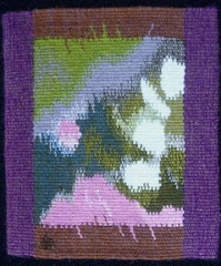
The annual meeting was at the historic Aldrich House, in Providence, on June 21st. The five new members were invited to each bring a piece of their art to be put on a lovely wrought iron  easel. I brought Chaos (don’t I always?)Austin_Chaos_ATA

The new members were introduced during the meeting. It was exciting to meet the other artists, and it turned out not to be at all intimidating, as everyone was very friendly.

ALRI was founded in 2000 by a group of about 40 artists, and provides exhibitions for member artists in all media!

As a tapestry artist I appreciate this open-mindedness, as some arts groups are not so inclusive. Rhode Islanders are far more informed about the textile arts than people in other regions, and my theory is that this is the result of growing up with Slater Mill, the birthplace of the American Industrial Revolution. Every child in RI visits there at least once on a school field trip. In addition to this, the Rhode Island School of Design, with their excellent Textiles department is very prominent here.

The mission statement reads:

The Art League of Rhode Island (ALRI) was formed based on a shared vision to encourage and foster artistic recognition and growth among Rhode Island Artists. ALRI was incorporated with a goal to contribute, encourage and promote integrity and excellence in the arts in Rhode Island. The Art League of Rhode Island numbers among its founding members some of Rhode Island's most prominent artists working in a wide range of media from painting to furniture making.

WarpingLoomThe 2012 Annual Exhibition will be opening on August 31.

More information about that later.

In the meantime I need some new tapestries to exhibit!

Time to leave the computer and get back to my looms!

Thursday, May 31, 2012

Tapestry Diary: Fun with Geometry

May is blue, at least this year it is. Blue, with green and black and white. I am using this year’s diary to explore ways to add color to my black and white tapestries, although I forgot all about that this month! AustinMay2012

Just to mix things up a bit, I broke some of my parallelograms into 4 pieces. Then I had a revelation: you can break a parallelogram into 2 triangles! What fun. After one week of triangles, I was sad that I couldn’t see the parallelograms any more, so I thought I would try to keep the 2 triangles in each day similar in color, and then have a more noticeable difference between each day. The last week, because I was always weaving light, then dark, I ended up with a surprising chevron pattern. I love this kind of surprise.

I weave a parallelogram every day. That pattern started years ago as a variation on lazy lines, just using different colors. It avoids slits. Every month I change the color scheme, and also the direction. On the bottom line of the May photo you can see the last 2 days of April on the right side, then the number 5 for the first day of May on the left. There is always a triangle at the intersection.

Until I wove the last day of May, I had no idea what I would do in June, but now I have a plan. Check back in a month, and I’ll post a photo of the first 6 months.

For links to the 2010 Tapestry Diary click here.

Here are some links to the 2012 Tapestry Diary

January       February      March      April

Monday, May 7, 2012

What is Tapestry Anyway?

Up to now, I assumed that most of my readers were fellow tapestry weavers. Perhaps not, since I give out my cards to lots of random people. So in case you were wondering….

Tapestry is a weaving technique that creates an image or pattern by using discontinuous weft.

Discontinuous what?

The WARP is the yarn that is attached to the loom and kept under tension; in this case, it’s the white cotton that runs vertically. The WEFT is the yarn that weaves under and over the warp threads to create the fabric.frameweavingIn the photo above you can see that there are 3 different colors of weft, and each color weaves back and forth just in the area where it is needed to create the design; that is what “discontinuous weft” means.  (In most fabric weaving, one piece of weft travels continuously from selvedge to selvedge.)

RedscarfIn most tapestries, the weft is packed down tightly, covering the warp completely, so the design is made just by the weft.

That’s different from most clothing fabrics, where you can see both the warp and the weft. These are 2 different scarves that I wove a few years ago.

FabricI like to use different colors in the warp and the weft, to create beautiful color blends.

Pretty simple, right? Actually it takes a lot of practice to be able to weave even a simple tapestry like the one above.

What about tapestry designs that are a lot more complex?

UnicornInCaptivityWeb2The photo on the right is The Unicorn in Captivity, a recently woven recreation, at Stirling Castle in Scotland. 

The original was woven around 1500, and hangs in the Cloisters, in New York City. 

For more about the Hunt of the Unicorn tapestries, and the project at Stirling Castle, see my previous blogpost  here.

For more information about tapestry weaving check out the American Tapestry Alliance website.

Wednesday, May 2, 2012

April Tapestry Diary

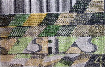
April was supposed to be yellow, but I couldn’t resist adding some light green too.

I was away for a week in early April, taking care of my 6 month old grandson, Silas. So when I came home, it was obvious what I had to do to fill up those days! I love designing and weaving text.

AprilMonthWhile I was away I visited the Textile Museum in Washington DC, and saw a wonderful tapestry by Archie Brennan (see the previous post), which inspired me to try different patterns in April. I am still thinking about ways to include small bits of color in my black and white tapestries, so this is good research.

I did tiny thin stripes, and one pick spots, and pick and pick spots for fatter dots, and color blends with dots, and dots created by alternating 3 colors of weft.

AprilDiaryThe dark shape on the top row, and the one just like it, one row down from the top, on the right, is dark gray wool mixed on the bobbin with a black and white cotton for the background.

Then there are small and bigger dots of light green, at irregular intervals, also mixed with the black and white cotton, and some dots that are pure green. I like the subtle, variegated effect. You can click on the photos to see them bigger.

What to do with May? I guess I’ll find out tomorrow…..I was too busy to weave it today, and now it’s almost midnight and I’m too tired.

AprilDiaryDetailDid I mention I have color-graphemic synesthesia? That means I associate certain colors with letters and numbers. It was much clearer to me when I was 5 or 6 years old, but there are still certain letters and numbers that are very clearly one color.

May could be green, because the letter M is green, but then I already did green for March; probably for the same reason. I was thinking about how I will weave the number 5 on the first day of May, then realized that May could be blue, because the number 5 is definitely blue (just like the letter S; must be something about that shape).

Anyway, blue and green will do nicely, and I can practice weaving the sea….I’ve been thinking about that lately.

Wednesday, April 25, 2012

Sourcing the Museum

at the Textile Museum, Washington DC
March 23 through August 19, 2012

“Museum  <Greek mouseion, temple of the muses…”

Jack Lenor Larsen invited 11 artists to each choose a piece (or pieces) from the museum’s collection, to use as their muse while creating a new, contemporary textile. The new pieces are displayed next to their muses, to (as the exhibit guide says) “reflect the connections between past and present.”

The artists are Olga de Amaral, James Bassler, Polly Barton, Archie Brennan, Lia Cook, Helena Hernmarck, Ayako Nikamoto, Jon Eric Riis, Warren Seelig, Kay Sekimachi, and Ethel Stein.

As a tapestry weaver, I was drawn to the exhibit because of the contemporary tapestry, but I knew I would also find other interesting pieces in the show. Unfortunately there was no catalog, and I was not allowed to photograph the exhibit. I’m sorry I have to write this without images, but you can look at a slideshow on the Textile Museum’s website here. (I had to use Google Chrome to see Archie’s slide full sized, it would not work on Firefox). You might want to open the slideshow in a separate window so you can refer to it as you read.

The first piece I saw was Archie Brennan’s tapestry “Sharing a Warp – a Meeting of Pure Chance – Asia/Mexico/the Himalayas - Seeking Unity 2011.” The title refers to the 3 pieces from the museum’s collection that he “chose” at random: pair of white embroidered festival pants from Mexico, a Kira from Bhutan , and a 19th century Shirvan rug from the Caucasus.

Archie calls this piece a “pseudo-collage,” because he created an illusion of 3 pieces one on top of the other, even weaving subtle shadows to indicate how they are layered. I was interested to see that Archie used the technique of doubling warps to change the sett. He used 10 ends per inch to weave the text at the bottom, which reads “…three works chosen at random from the collection of the Textile Museum Washington…” but then doubled the warps to create a coarser texture of 5 ends per inch for the Shirvan rug section. This coarser texture reproduces the pile of the original rug, and also allowed him to use pick and pick to make bold vertical stripes representing the fringe. He says that the fringe was a way to emphasize its “hanging nature.”

Above the rug are the two other references, the finely embroidered Mexican pants on the left, and the diamond patterned Kira on the right. I was particularly drawn to the Kira, where Archie used various woven patterns of dots, stripes, checks and diamonds inside each diamond shape, and the triangles forming the background; the woven patterns are intended to emphasize the cloth nature of the Kira, and they gave me a sense of deja vu, as if I had seen them as a sweater or a tie in a much earlier Archie Brennan tapestry.

The diamond shapes are not centered, so the width of the yellow outlines varies, creating an amusing distortion. Archie said he did that because he felt it was getting too symmetrical. He says he also pulled the warp slightly off vertical in another area, although I can’t see it from the photo. Another detail that caught my eye was the visible shiny red stitches holding together the vertical stripes.

Archie wove this tapestry without a cartoon, just using some sketches, notes and working drawings where needed. He said he loves the journey up the weaving, and the way the tapestry grows on the loom, and admitted that he had been influenced in this method of working by Susan Martin Maffei.

Lia Cook’s jacquard weaving “Coptic Manga” blew my mind. Her muses were 2 small Coptic tapestry fragments, and I recognized the faces in her piece immediately, even with the “altered scale.” The piece looks so different from a distance where the colors blend, and from close up, where you see the woven pattern structure and the separate colors; kind of like an impressionist painting. It made me think about my own black and white tapestries, and my quest to add color to them. The way she has added color to the black and white is reminiscent of hand tinted photographs, or, in this case, comic strips. Very inspiring. If you click on any of her images here you can see a close up of the weave structure.

Jon Eric Riis was inspired by a Chimu jacket from Peru (1250-1350), which might be the most stunning piece in the show, although Riis’s own tapestry jacket is definitely a show-stopper. The “Congressional Constraint Tapestry” is “a straightjacket in politically-charged red and blue, with donkeys, elephants, and hybrids of the two, fringed with boxing gloves.” Tapestry weavers will be impressed that the pairs of boxing gloves (at least 72 pairs, I lost count!) are all individually woven shaped tapestries. The docent said that he had woven them on plane trips. The jacket itself is woven very finely, with glittery metallic thread, silk, horsehair and coral and gold beads.

Helena Hernmarck chose a tiny 9th Century Egyptian rug fragment, and enlarged a detail.  With her expressive, loosely woven surface, focusing on color, and showing the pile and the dissolving warp, I had to walk into the next gallery to see it from enough of a distance. Then it became very 3 dimensional.

You can read the Washington Post’s review of the show here. If you live close enough, don’t miss this show!