Wednesday, April 25, 2012

Sourcing the Museum

at the Textile Museum, Washington DC
March 23 through August 19, 2012

“Museum  <Greek mouseion, temple of the muses…”

Jack Lenor Larsen invited 11 artists to each choose a piece (or pieces) from the museum’s collection, to use as their muse while creating a new, contemporary textile. The new pieces are displayed next to their muses, to (as the exhibit guide says) “reflect the connections between past and present.”

The artists are Olga de Amaral, James Bassler, Polly Barton, Archie Brennan, Lia Cook, Helena Hernmarck, Ayako Nikamoto, Jon Eric Riis, Warren Seelig, Kay Sekimachi, and Ethel Stein.

As a tapestry weaver, I was drawn to the exhibit because of the contemporary tapestry, but I knew I would also find other interesting pieces in the show. Unfortunately there was no catalog, and I was not allowed to photograph the exhibit. I’m sorry I have to write this without images, but you can look at a slideshow on the Textile Museum’s website here. (I had to use Google Chrome to see Archie’s slide full sized, it would not work on Firefox). You might want to open the slideshow in a separate window so you can refer to it as you read.

The first piece I saw was Archie Brennan’s tapestry “Sharing a Warp – a Meeting of Pure Chance – Asia/Mexico/the Himalayas - Seeking Unity 2011.” The title refers to the 3 pieces from the museum’s collection that he “chose” at random: pair of white embroidered festival pants from Mexico, a Kira from Bhutan , and a 19th century Shirvan rug from the Caucasus.

Archie calls this piece a “pseudo-collage,” because he created an illusion of 3 pieces one on top of the other, even weaving subtle shadows to indicate how they are layered. I was interested to see that Archie used the technique of doubling warps to change the sett. He used 10 ends per inch to weave the text at the bottom, which reads “…three works chosen at random from the collection of the Textile Museum Washington…” but then doubled the warps to create a coarser texture of 5 ends per inch for the Shirvan rug section. This coarser texture reproduces the pile of the original rug, and also allowed him to use pick and pick to make bold vertical stripes representing the fringe. He says that the fringe was a way to emphasize its “hanging nature.”

Above the rug are the two other references, the finely embroidered Mexican pants on the left, and the diamond patterned Kira on the right. I was particularly drawn to the Kira, where Archie used various woven patterns of dots, stripes, checks and diamonds inside each diamond shape, and the triangles forming the background; the woven patterns are intended to emphasize the cloth nature of the Kira, and they gave me a sense of deja vu, as if I had seen them as a sweater or a tie in a much earlier Archie Brennan tapestry.

The diamond shapes are not centered, so the width of the yellow outlines varies, creating an amusing distortion. Archie said he did that because he felt it was getting too symmetrical. He says he also pulled the warp slightly off vertical in another area, although I can’t see it from the photo. Another detail that caught my eye was the visible shiny red stitches holding together the vertical stripes.

Archie wove this tapestry without a cartoon, just using some sketches, notes and working drawings where needed. He said he loves the journey up the weaving, and the way the tapestry grows on the loom, and admitted that he had been influenced in this method of working by Susan Martin Maffei.

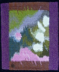
Lia Cook’s jacquard weaving “Coptic Manga” blew my mind. Her muses were 2 small Coptic tapestry fragments, and I recognized the faces in her piece immediately, even with the “altered scale.” The piece looks so different from a distance where the colors blend, and from close up, where you see the woven pattern structure and the separate colors; kind of like an impressionist painting. It made me think about my own black and white tapestries, and my quest to add color to them. The way she has added color to the black and white is reminiscent of hand tinted photographs, or, in this case, comic strips. Very inspiring. If you click on any of her images here you can see a close up of the weave structure.

Jon Eric Riis was inspired by a Chimu jacket from Peru (1250-1350), which might be the most stunning piece in the show, although Riis’s own tapestry jacket is definitely a show-stopper. The “Congressional Constraint Tapestry” is “a straightjacket in politically-charged red and blue, with donkeys, elephants, and hybrids of the two, fringed with boxing gloves.” Tapestry weavers will be impressed that the pairs of boxing gloves (at least 72 pairs, I lost count!) are all individually woven shaped tapestries. The docent said that he had woven them on plane trips. The jacket itself is woven very finely, with glittery metallic thread, silk, horsehair and coral and gold beads.

Helena Hernmarck chose a tiny 9th Century Egyptian rug fragment, and enlarged a detail.  With her expressive, loosely woven surface, focusing on color, and showing the pile and the dissolving warp, I had to walk into the next gallery to see it from enough of a distance. Then it became very 3 dimensional.

You can read the Washington Post’s review of the show here. If you live close enough, don’t miss this show!

Sunday, April 1, 2012

Tapestry Diary Marches On

…sorry for the bad pun! March2 Here is the month of March, minus the first 3 days. Oops, when I took the photos I forgot that March started at the tail end of a February week.

MarchText Every line of parallelograms begins on a Sunday. Luckily, April 1 is a Sunday so that will be nice and tidy.

For March, I went back to my original idea of experimenting with ways of introducing little bits of color into my black and white tapestries. I’ve been enjoying the green accents.

MarchDetail I wove “MARCH,” one letter per day, which allowed me to use a favorite tapestry technique: weft interlock. I rarely use this in my tapestries, but it is very useful, particularly when you have a long vertical as in these letters.

For the rest of the month, as for most days in this diary, I wove what I felt like weaving. In the last week, I felt like dividing each day diagonally, creating triangles. One of the 3 basic shapes, the other 2 being rectangles and circles.

For more about the tapestry diary check herehere, and here.

Monday, March 26, 2012

Fiber in the Present Tense:

Contemporary Art Textiles by the Massachusetts-Rhode Island chapter of the Surface Design Association FiberInThePresentTense March 3- April 22, 2012 at the Arsenal Center for the Arts, in Watertown, Massachusetts.

FiberinPTI joined SDA recently because I had heard that the fall 2011 issue of their journal featured some tapestry articles.

It’s true, and it’s an excellent journal.

MalikSaberah Malik, Boundaries Unbound, shibori dyed polyester on steel base. (above)

I was too late to enter this exhibit, but I drove there for the opening reception on Saturday. I got lost a few times, and seriously considered giving up and going home, but I finally found it, and I’m glad I did!

CrascoIt’s a really impressive show, although it’s spread out on 3 floors, mostly in hallways. I would rather have seen all the works in one gallery without the other distractions.CrascoDetail

The juror was Alice Zrebiec. She selected Swimming Against the Tide, (above and right) by Nancy Crasco, for the SDA Award of Excellence. This piece is gelatin print, embroidery and stitching on silk organza, 36” x 36.”

McCarthyDiptych

McCarthyDetailKaren McCarthy, Unexpected Turns (diptych)  (above, and detail at left)

I don’t know much about printing, so it was educational. I took a silk screening workshop about 40 years ago, but can’t remember much about it.

I was intrigued by the textile texture in this print, and the artist explained to me that she prints through lace.

The call for entries reads:

“Scope, materials and subject matter are open and submissions may include surface design, woven, 2D and 3D structures, quilts, stitching, or any other contemporary art textile technique.”

GrotrianChasmLakeI had always assumed that SDA was limited to surface design (printing, painting, embroidering and embellishing the surface of a textile), but the organization seems to be inclusive of all fiber arts.GrotrianDetail2 

Nevertheless, most of the works in the exhibit are surface design, with very little that is woven or otherwise constructed.

I took an instant liking to this landscape, Chasm Lake,  by Carol Ann Grotrian (above and right)HoustonUndertheMicroscope

I love the ambiguity in the combination of shibori and hand quilting, which you can see much better in the detail.

I was introduced to a young artist from RI, Hannah Houston, a recent art school graduate. It’s nice to know there are still some young folks studying fiber arts.

Her piece, Under the Microscope, (left and below) is really stunning.


HoustonEvery time someone walked past it, the lightweight silk fabric would billow out from the wall, which was beautiful, but made it a bit challenging to photograph!

It is digitally printed with foil embossing.

I didn’t notice the title (Under the Microscope) until I got home, but it makes perfect sense when you look closely. I’ve always thought that microscope images could make great textile designs, and now I know it!

NobleAnother favorite is this powerful piece by Elin Noble, Conversation (left).  The description reads:

“Itajime clamp-resist on hand-woven hemp cloth, hand pieced with horsehair.”

I had no idea what itajime was, so I looked on Elin’s website and found this description:

“Itajime shibori, or clamp-resist dyeing, is based on wooden boards held on either side of accordion folded cloth, then dyed.”NobleDetail

That sounds exciting! I wonder if there are surprises after the dyeing? I love the horse-hair stitching. 

Don’t forget, you can click on most of these photos and see a larger version.

Better yet, go see the exhibit!

Friday, March 9, 2012

Teachers and Lessons

For the latest issue of the American Tapestry Alliance’s quarterly journal, Tapestry Topics, the theme editor, Micala Sidore, asked:

What teacher (or teachers) have had particular consequence for your work as a tapestry weaver?

I didn’t have to think about it for long: Marcel Marois, because he was the first teacher who was supportive of my choice to weave tapestries that translate the marks of my paintings and drawings. That validation, which came at a crucial point, helped me to trust my instincts and continue in my own direction.

005 I also learned one very important practical lesson from Marcel: when weaving with 2 contrasting colors in my weft bundle, I learned to make a conscious decision about how the 2 colors interact. 

The dark wefts can always be on top of the light ones, or always underneath, or any combination of the two.

The weft can be twisted carefully, or it can be allowed to twist at random. At this point, with my black and white Chaos series, I am choosing to control almost every dot to get the exact effect I want.

Marcel also suggested that, in the tapestries secretmessage2 I was weaving from watercolor designs, adding a thin white thread (I used silk) would give the impression of the white paper showing through the translucent paint.

This is “Secret Message,” and you can see “Secret Message 2”  here.

Subscribe to Tapestry Topics here.

Tuesday, February 28, 2012

Happy 100th Birthday, Newport Art Museum

IMG_2507 As part of the festivities, the Newport Art Museum is hosting a very special  “Members’ Juried Exhibition.”

For just this year, because it’s the Centennial, all 329 works submitted were accepted for exhibition!

The three jurors have each chosen a group of awards, which are being announced on 3 different dates.

NAMWall8 I attended the gallery talk yesterday, where award winners and any other artists in attendance were invited to talk about their work.

I told the group that my mission in life is to make sure everyone knows that NAMAustinTapestry, despite the New York Times’ description of it as a dead art form, is very much alive.

Here is my small tapestry, “Turning from Chaos,”  on the left.

This is the one that was chosen for Small Tapestry International: Passages, and traveled to Taos, NM, Tacoma, WA and Glen Ellen, VA  in 2011.


The other works in the show include many in the traditional media: painting, watercolor, printmaking, photography, and drawing.

In addition there is one punch hooked rug, and works made of NAMWall1ceramic, tin, wood, steel, bronze, glass, a log, salvaged graffiti, dolls, bark, alabaster, rose stems with thorns, found objects, concrete, electronics, steel cabling, “fiber,” cast paper, copper, gold leaf, crystal,  insulation foam, marble, horse tail, and even “Marine Algae harvested from Rhode Island coastal waters!”


Wow! Two galleries, plus the entryway, are completely covered with art work, quite an accomplishment by the museum staff who put it all together.NAMWall9

Visitors were encouraged to vote for their favorite piece, kind of overwhelming….but the one that really spoke to me was a small oil painting by Libby Manchester Gilpatric, “Beets and Beds.” I wrote it down on the ballot, then when I got home I found it in my pocket. Oops! Forgot to put it in the box and forgot to photograph it, but you can see it here.


IMG_2499

Federico Santi’s color changing crystal and electronic “Urchin,”  was a lot of fun to watch.

It appeals to my inner child who loves everything colorful and sparkly.


IMG_2501Here are just three of the many colors this urchin wears…..don’t you love the reflections in the black pedestal?


IMG_2502

If you’re in the area, come to the Museum on March 30, 5-7, for the announcement of the third round of awards.